
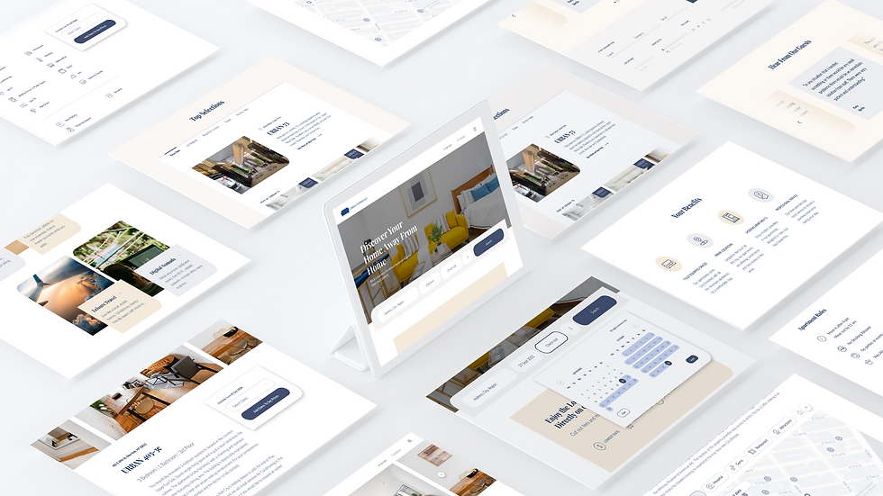
WEBSITE DESIGN
Urban Furnish is a property rental company based in New York, offering fully furnished apartments. Their properties are listed on popular platforms like Airbnb, Blueground, and Vrbo, but they also maintain their own website where customers can book directly.
Urban Furnished
DIRECT BOOKINGS AND GLOBAL EXPANSION
Business Goal
Their goal for redesigning the website is to
1
Boosting direct bookings on their website to avoid platform commissions.
2
Expands to feature new properties in global locations.
UNDERSTAND THE USERS
User Research
In order to achieve this goal, I first start to understand the needs of the users. Since interviewing actual customers was beyond budget, I spoke with the customer support team, who interact daily with clients and have insights into common pain points during booking and stay.
Who Are The Users?
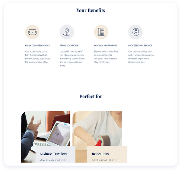
BUSINESS TRAVELLERS
I need a quiet, work-ready apartment with fast Wi-Fi, easy check-in and flexible billing.
STUDENTS ON INTERNSHIPS
I’m seeking affordable, furnished housing near my placement with month-to-month terms.
FAMILIES RELOCATING
We want a spacious, pet-friendly fully quipped home near schools, extendable monthly.
PATIENTS
I need a calm, accessible stay near hospitals, with elevators, privacy, and flexible extensions.
What Do They Care About?
LOCATION
Proximity to specific locations, such as work or hospitals.
Walking distance to subway or public transportation hubs
PRICE
Finding apartments within a set budget
Evaluating the cost-effectiveness of different options
AMENITIES
Requirement for high-speed reliable internet connection, wheelchair accessibility, fully equipped kitchenware etc.
THEIR GOALS
To find an affordable short-term rental (1-2 months) in a convenient location that meets essential amenity requirements.
USER'S VIEW OF THE WEBSITE
Website Inspection
To address the business objectives and user needs, we conducted an inspection of the current website to identify potential reasons for the low direct bookings. Our findings revealed that:
Brand Recognition
The landing page lacks a cohesive narrative, making it difficult for users to immediately understand the brand’s identity and purpose.

USABILITY ISSUES
Some elements look interactive but are not clickable, creating confusion and unmet expectations.

In the booking flow, users who did not meet the 30-day minimum requirement often assumed no housing was available, as the system lead them directly to the page prompting no housing available and failed to explain this restriction.
VISUAL INCONSISTENCIES
Misalignment in visual elements—such as icons, fonts, and color schemes—creates a disjointed aesthetic, undermining the site’s professionalism.

INFOMRATION CLARITY
Key details, such as the number of rooms, location, price, and nearby subway access, need a clearer and more structured presentation to support user decision-making effectively.

Solution
Align the website’s structure with the needs of the target users to enhance usability.
HIGH LIGHTING KEY INFORMATION
Recognizing Brand
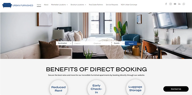
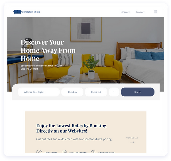
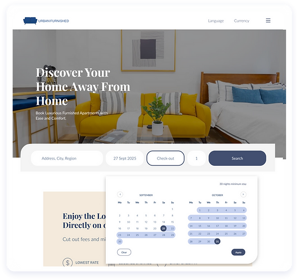
Ensure the title page features a hero image and a clear title statement, so users arriving from search engines can quickly understand what the website is about, the services offered, and how it stands out from similar platforms.
OLD VERSION

NEW VERSION

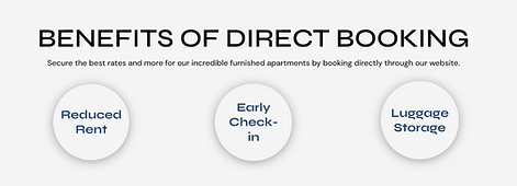
Display benefits of direct booking prominently for users coming from third-party platforms like Airbnb, Blueground, or Vrbo to encourage bookings through the website.
OLD VERSION
NEW VERSION

FEATURE PROPERTIES IN GLOBAL LOCATIONS
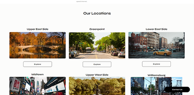
Worldwide Properties
The redesign extends the platform’s scope from a local focus to a global marketplace, through clearer property discovery, a streamlined header, and search functionality that now supports multiple cities. These updates ensure the design aligns with both business expansion goals and the needs of a global user base.

OLD VERSION

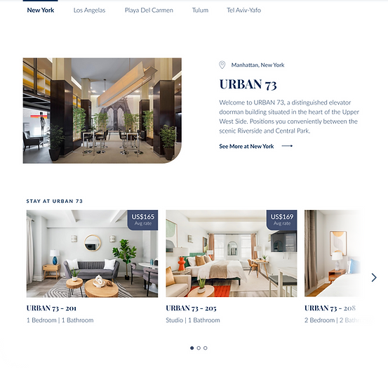
The new design introduces apartments by city, giving users clear information about where the company’s properties are available.
NEW VERSION
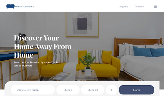
The redesigned header features a cleaner, more focused layout with fewer items, moving secondary options into the hamburger menu, and introduces language and currency selectors to better serve our global users.
OLD VERSION
NEW VERSION
OLD VERSION
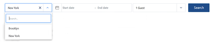
The search bar, which previously only displayed results for Brooklyn and New York, now accommodates a global audience.
NEW VERSION

CLARIFYING BOOKING RULES
Improved Usability
The redesign resolves a major usability issue by making stay requirements transparent—shifting from misleading error pages to clear guidance that helps users understand booking limitations without confusion.
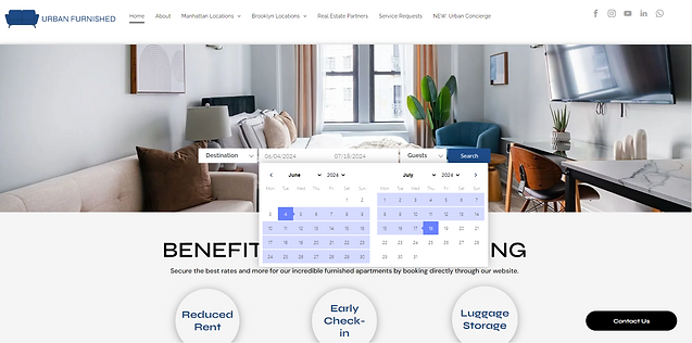
OLD VERSION
In the old design, entering fewer than 30 days directed users to a ‘no results’ page, misleading them into thinking no housing was available.


NEW VERSION
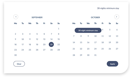
In the new design, users are prompted with a ‘30-night minimum stay’ message when hovering over dates that do not meet the requirement.

ENHANCING CONTENT DESIGN
Information Calrity
The redesign improves content delivery by making information more concise, relevant, and scannable while adding transparency in pricing, location, and amenities. These updates reduce user confusion, build trust, and ensure critical details are easier to access and understand.
OLD VERSION
NEW VERSION

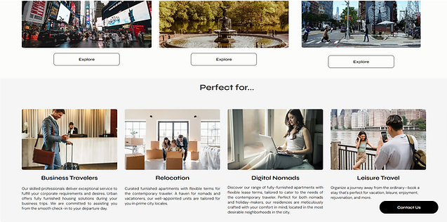
Make content more scannable by shortening it, keep information highly relevant to user needs, and work with the SEO team to identify low-competition keywords for use in meta titles, descriptions, and image alt text.


Include the full address to reduce confusion and use an interactive map instead of plain text to help users visualize the location more easily.
Location
Easier Access to Critical Information
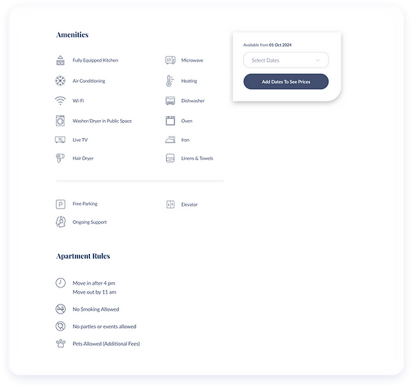
Amenities
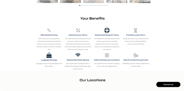
Organize amenity information in a clear, consistent, and easy-to-understand manner.
NEW VERSION
Prices
Prices are now clearly displayed, helping users quickly check affordability, build trust, and reduce financial worries.

OLD VERSION

Typography & Color
Font Family
Playfair Display
Lato
#0D2F58
#424F70
#F4EADC
#F4F4F4
H1
56px
Playfair Display - Bold
H2
36px
Playfair Display - Bold
H3
24px
Playfair Display - Bold
Paragraph
24px
Lato - Light
Paragraph
18px
Lato - Light
Paragraph
14px
Lato - Bold
#F4EADC
Paragraph
16px
Lato - Regular
#F4F4F4
USER'S VIEW OF THE WEBSITE
Result and Data
My design approach for the Urban Furnished website directly addresses both user and business goals. By aligning content strategy and visual elements, I aimed to simplify navigation, make critical information more accessible, and clearly convey the benefits of booking directly.

Enhanced Usability and Clarity
The redesigned structure and content organization ensure that essential information, such as apartment features, location, and amenities, is presented in a concise and easy-to-scan format. Users can immediately grasp key details, enhancing their decision-making process.

Consistent Branding and User-Friendly Content
The unified visual style and concise content improve the brand’s professionalism and readability, appealing to users from various demographics. By incorporating relevant SEO keywords and ensuring clear communication of booking limitations, the design further attracts the target audience while setting clear expectations.

Improved Direct Booking Rate
With support from the SEO team, direct bookings increased gradually from 30% at the beginning of summer to 50% by the season’s end—and continue to grow.